Gallery
A quick visual tour. Want the code behind every figure, with its output inline?
See the Showcase — it's examples/showcase.py
executed end to end, with one-click Open in Colab / Binder links so you can
run it yourself. Everything here is generated by docs/generate_gallery.py — no
hand-tuning — and regenerated by CI on every docs build.
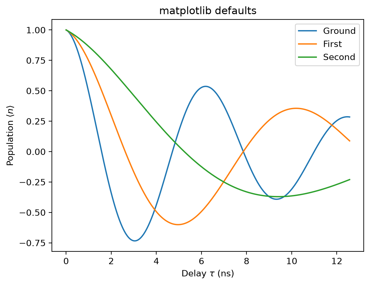
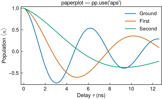
Before / after
The same three-curve plot, same data — stock matplotlib defaults versus one
pp.use("aps"). paperplot fixes the column width, type scale, color cycle, tick
style, and line weights in a single call.
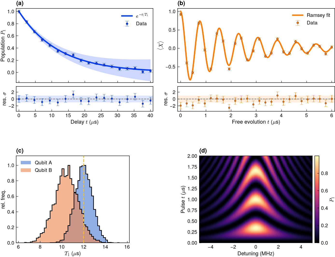
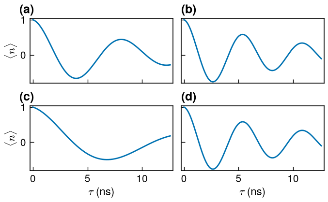
A full results figure
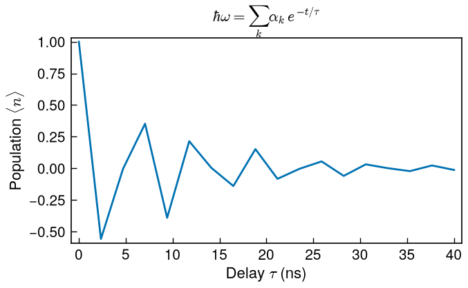
One GridSpec, four panel letters: (a) $T_1$ relaxation and (b) Ramsey
fringes — each a data_fit_band fit with a flush residual strip sharing its
x-axis — plus (c) outlined $T_1$ distributions and (d) a chevron map. The
journal styling, fonts, and line weights carry through a hand-built grid.
Figures
-
APS, single column (8.6 cm)
-
APS, 4-panel single column
-
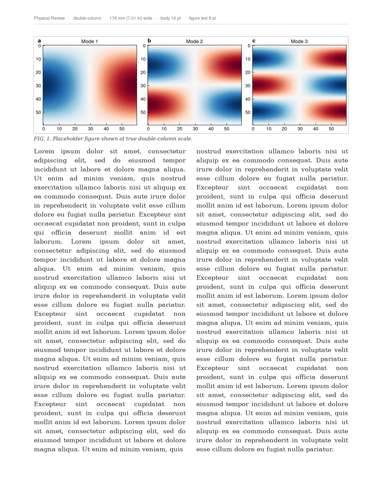
Nature, double column (183 mm)
-
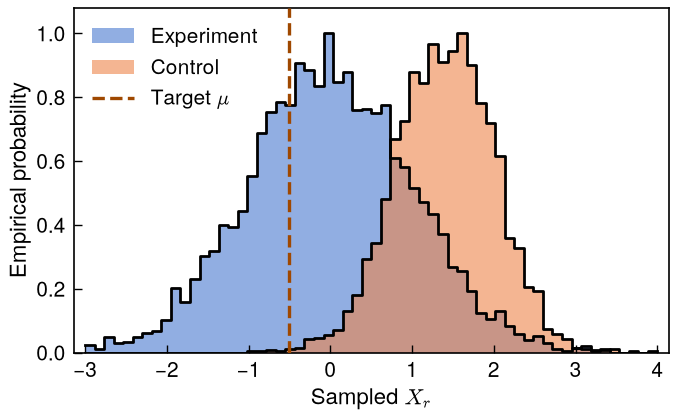
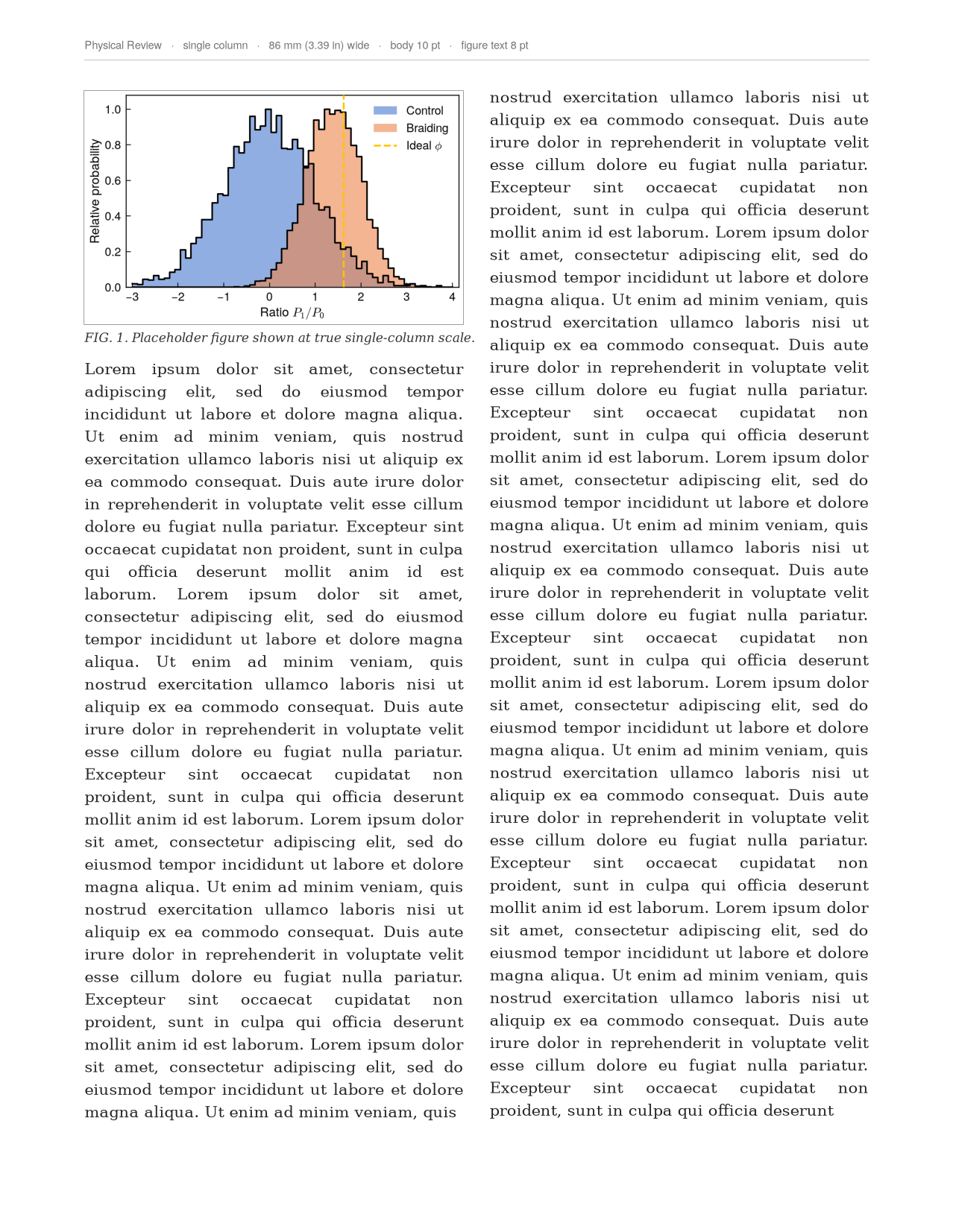
Overlapping outlined histograms
-
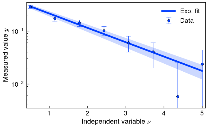
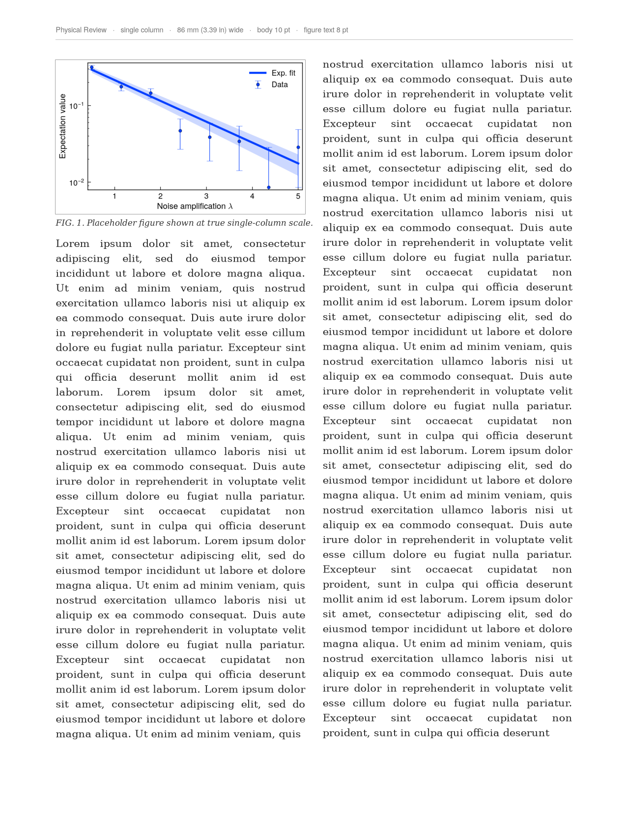
Data + fit + confidence band
-
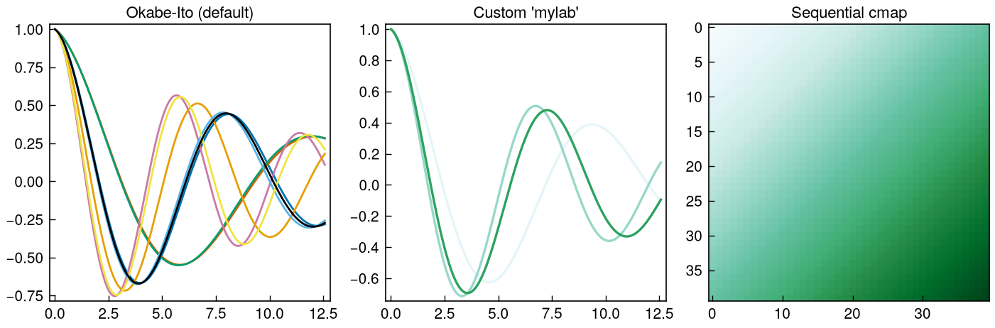
Okabe-Ito, custom palette, sequential cmap
Math typography
The LaTeX look (Computer Modern) is the default over sans-serif labels — no LaTeX
install required. math="sans" pairs sans math with Arial/Helvetica labels.
On the page
This is the part most styling packages don't do. preview_in_page() drops your
figure into a true-to-scale mock journal page with real justified body text, so
before you ever submit you can see exactly how large it lands in the column and
whether the lettering still reads at that size. Same figures as above — now in
context.
-
APS single column — in page
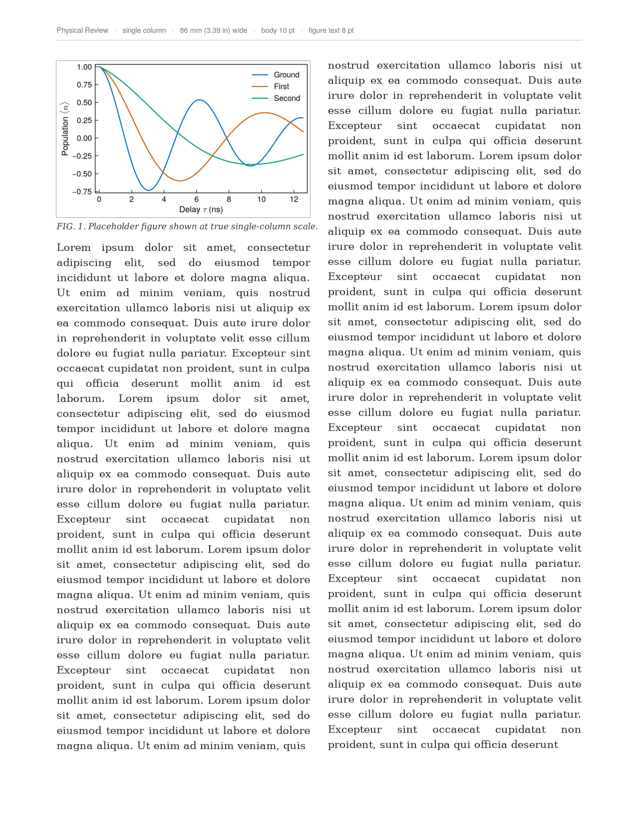
-
Overlapping histograms — in page
-
Data + fit + band — in page
-
Double column across both columns — in page
Proofing
grayscale_proof() checks print legibility for the APS H24 (grayscale) reality —
print is still often black-and-white, and colors that look distinct on screen can
collapse to the same gray.